We now offer responsive website design for mobile devices.
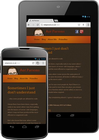
Responsive websites use the same design regardless of device being used. The difference is the layout can alter depending on screen resolution and whether the screen is portrait or landscape.
A three column website can easily become a two column or one column website, simply by shuffling the content round appropriately. Buttons that would be too small on a smartphone screen can be enlarged and font sizes increased.
So if you're looking to make your website smartphone and tablet friendly, get in touch now!
Posted in Services on the 22nd April 2013 at 3:56pm.