Website for professional decluttering and organising business
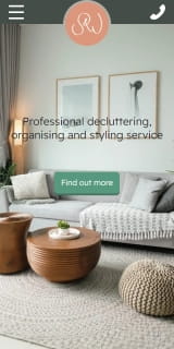
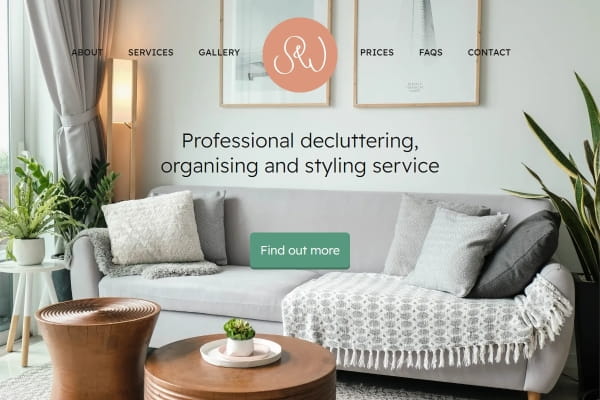
Sarah and Anna wanted the website for their decluttering business to have a warm feeling. Researching their competitors, there was an overwhelming number of plain white websites which, while white gives the impression of clean, felt cold.
I was able to incorporate colours from their logo throughout the design. We kept their menu structure clean and simple for easy navigation.
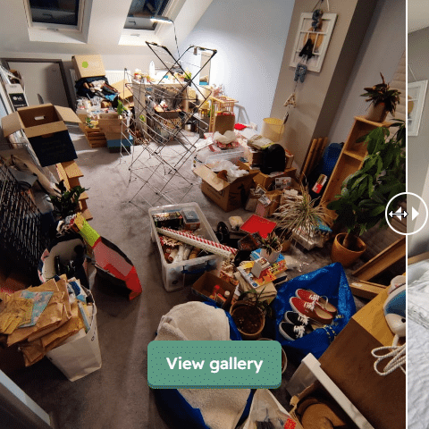
I wanted to include some interactivity into the design. Given that their work can be shown off with before and after photos, I built a slider so that website users can slide between the before and after photo.
Lastly I asked the designer of their logo if I could have a specific format of their logo so that I could surprise them with a neat animation when visitors reach their homepage.
![]()
Ant designed and made our website for us, and we are absolutely chuffed with it. He took the time to answer our questions, fulfil our requests and was so prompt in making the changes we asked for. He explained to us what made a good website and what made a poor website, what flowed and what didn’t. It has exceeded our expectations and has been a big part of us launching our business. We highly recommend him!